An excited me next to the final full size prototype of one of the Flourishes. This was made for final sign-off of the central element details. Photograph by Poppy Veerasawmy (Creative Facade).
BACKGROUND
In early 2014 I was shortlisted, along with three other Australian Artists, to competitively bid for The Milton Artwork Public Artwork Façade opportunity. Each artist had six weeks to develop a unique artwork concept and submit a detailed expression of interest that included their artwork concept, composition, buildability and fabrication methodology.
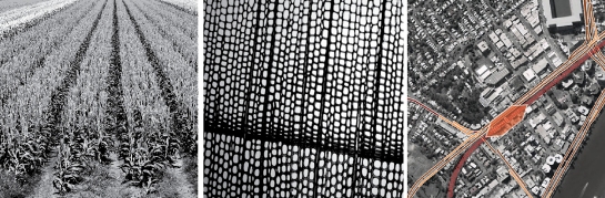
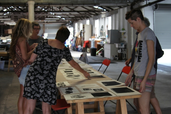
Concept behind Flourish – Patterns of Milton’s early land use and how they mirrored some of the micro structures within native and crop species.
After visiting Milton and undertaking research into the site’s history I was intrigued by Milton’s development over time. Of particular interest were the patterns of early land use and how they mirrored the micro cellulose structures within native and crop species. I tested my initial concepts using a series of small handmade models. Some of the models just tested the individual elements’ form, while larger studies explored the overall composition and visual permeability of the artwork. These studies then directly informed the 3D computer models and renders. Flourish’s composition frames a field’s edge where native flora have re-grown and flourished.
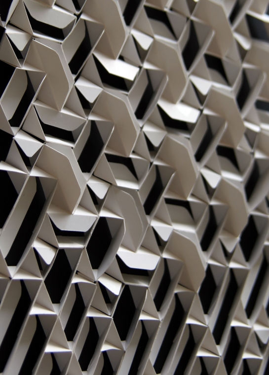
Different from all angles – Flourish handmade artwork of a small portion of The Milton Artwork Facade for my Concept Proposal, February 2014 (Dimensions 550 x 375mm). Photography Christina Waterson.
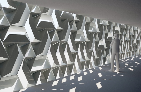
Concept render of view from within the spaces behind Flourish, prepared for my Milton Artwork Facade Concept Proposal, February 2014.
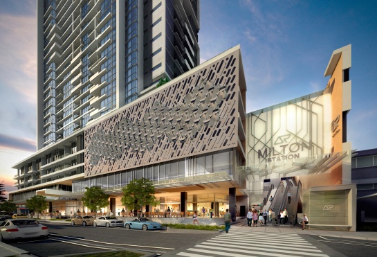
Initial concept render of Flourish – thrive prosper bloom, February 2014. The artwork marks the Railway Terrace entrance to Milton Train Station.
My final EOI included the Flourish artwork concept; handmade models; facade elevations and sections; interior and exterior views; assembly methodology; as well as detailed quotations from three local manufacturers.
In late 2014 to my joy I’d successfully been selected as the preferred artist for the project.
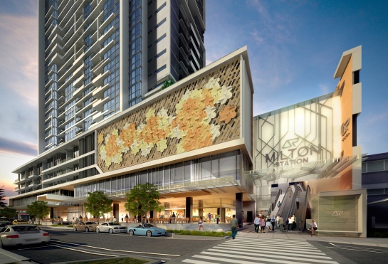
Showing colour and how the work progressed throughout the process – here is the revised concept render of Flourish presented to the BCC.
After initial briefing with the Project Stakeholders I incorporated their great feedback to add colour and further develop the composition option that incorporated a central dimensional flourish design framed by flatter border panels. At the end of 2014 my revised composition was approved by the Client and submitted to the Brisbane City Council (BCC).
DESIGN DEVELOPMENT, FABRICATION AND INSTALLATION
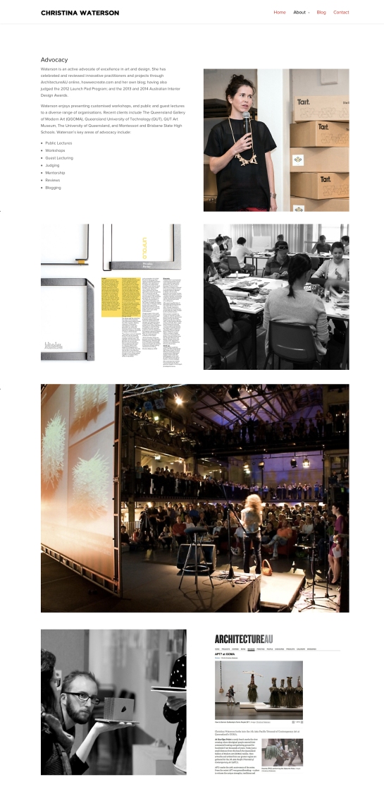
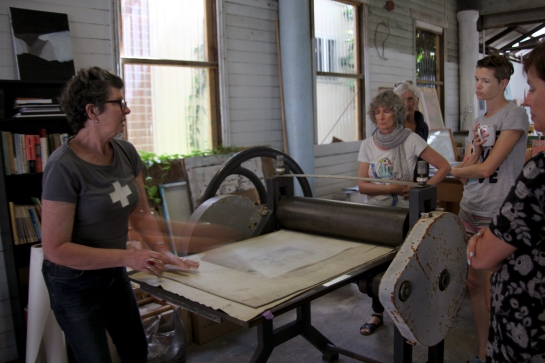
Team meetings with the client, fabricators and documenters for design development, documentation and prototyping happened in the first half of 2015.
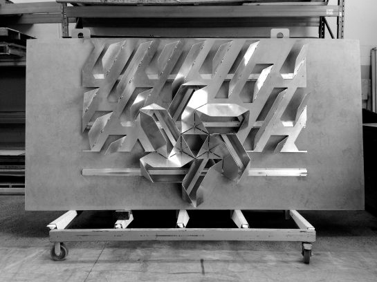
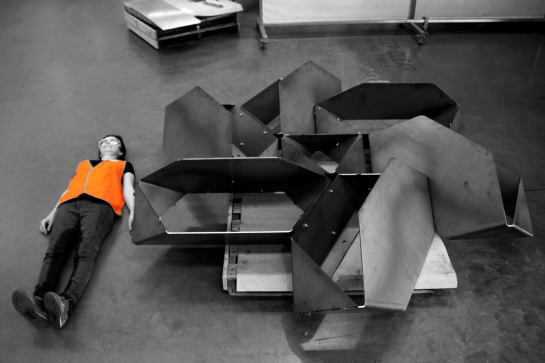
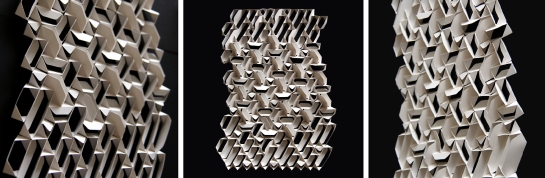
One of many prototypes made by Auzmet for Hutchinson Builders, during Design Development and Documentation. Pictured is a half scale prototype of a central Flourish element with the border design. Photography by Christina Waterson.
This was an intensive and rewarding process in which details of the artwork and its elements were streamlined for material properties and sheet efficiency; as well as for the fabrication process. The artwork’s overall layout was further developed during this time to accommodate weight and support requirements. The design of the fretwork was developed to meet the revised free air requirements in those areas while also concealing the artworks orthogonal support frame. I worked closely with Poppy Veerasawmy (Creative Facade) throughout this process.
The final colours (based on native flower species), artwork layout and details were signed off in May 2015 with the approved design being fabricated in June and July. It was really great that the artwork was made in Brisbane by local manufacturers who specialise in metal fabrication and coating. It meant I could visit each fabricator on a regular basis, stay in touch with progress and photograph the fabrication process.

Just a few of the 200 or more Flourish parts awaiting finishing and transport to the painters. Photography by Christina Waterson.
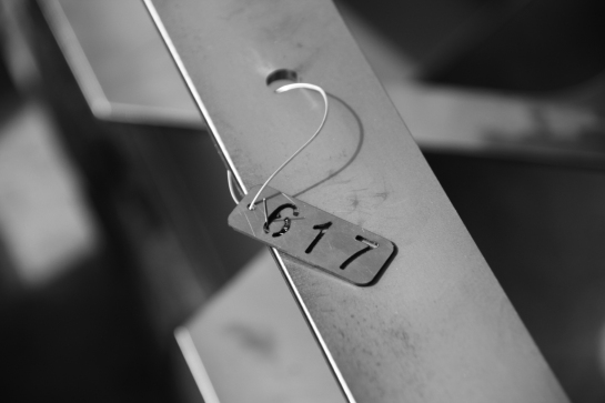
Labelling of parts that make up the central Flourish panels prior to coating. Photography by Christina Waterson.
At the painters each element was painted prior to assembly. Photography by Christina Waterson.
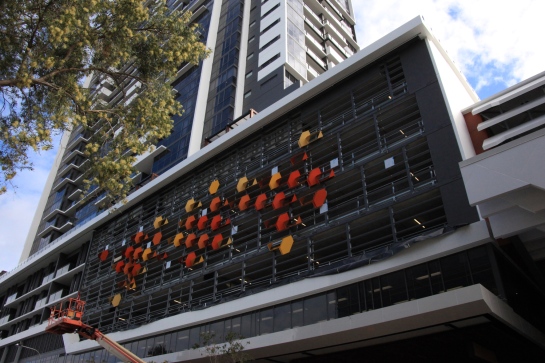

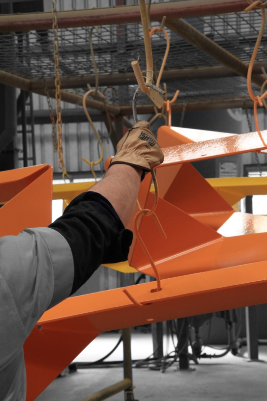
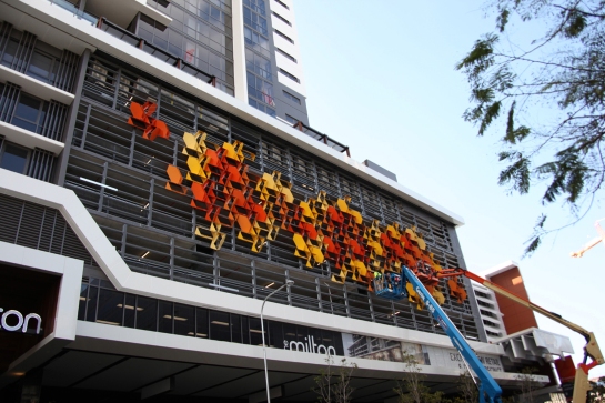
During installation of the central Flourish area. Photography by Christina Waterson.
Installation started in August and was completed in September 2015. I visited the site weekly to see how the artwork had grown. It was an affirming experience to witness it evolve to completion. The details that we’d worked through during design development/documentation contributed to the overall effect and success of the artwork.
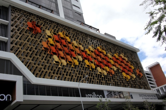
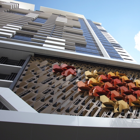
View to Flourish – thrive prosper bloom from Railway Terrace footpath. Photography by Christina Waterson.
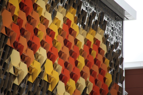
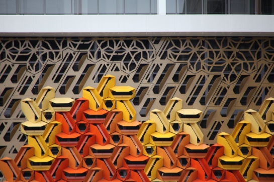
Different from different angles: An acute detailed view to Flourish – thrive prosper bloom north along Railway Terrace. Photography by Christina Waterson.
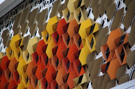
An acute detailed view Flourish – thrive prosper bloom south along Railway Terrace. Photography by Christina Waterson.
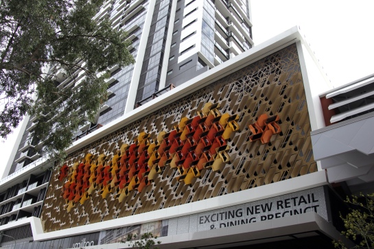
Flourish – thrive prosper bloom 2015 from Railway Terrace, Milton. Photography by Christina Waterson.
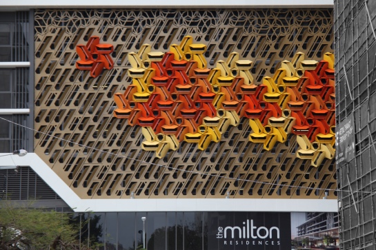
Long front view of Flourish from Manning Street approach. Photography by Christina Waterson.
Since Flourish’s completion I’ve received lovely feedback from visitors to Milton. People especially love the artwork elements, colour and the way the composition looks different from all angles.
PROJECT DETAILS
Client: Commissioned by Aveo Group Ltd and Hutchinson Builders
Name: Flourish – thrive prosper bloom 2015
Medium: Painted steel
Location: The Milton Residences, 55 Railway Terrace Milton, Queensland, Australia.
Artwork Area: Over 440 sqm
Built locally in Brisbane by Hutchinson Builders through Auzmet, Creative Facade, GCI Group, and Peerless Painting and Sandblasting.