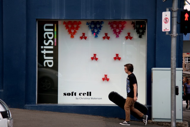
Archive

Tag Archives: nature

Kinetic Rain by ART + COM completed in July 2012.

After a short but sweet stay in Singapore it was time to head home. On arrival at Singapore’s Changi Airport there was the usual struggle with bags; looking for the right check-in desk and last-minute rummage through carry on luggage. Then suddenly and quite unexpectedly, amid the Departure-Check in Hall, I saw Kinetic Rain.

One part of a set of two installations

I was mesmerised.

For the Departure Hall, ART + COM were commissioned to make an artwork that captured the essence of the place. This group of artists, designers and developers came together in 1988 with a shared belief that ‘the computer was more than a tool’. They have a practice that creates unique installations, environments and architecture made possible through the development of technological innovations and inventions.

My mind and memories set in motion through this artwork.

‘Glimpses of ideas, abstract and concrete hover in the air between the clouds in the sky and the rippling water surface below, contemplating the dream of flying… of dreams becoming reality through determination and feats of engineering and science.’ ART + COM’s Artist Statement, Changi Airport.

After experiencing the afternoon showers and humidity of Singapore this artwork resonated strongly with me. The array of hundreds of droplets seemed to float through space as they completed their programmed sequence of movement. It was like experiencing rain in slow motion close up.

How beautiful and perfect and moving. Infinite patterns, sequence and…

The reflective surface of each droplet captured the people looking on in a beautiful state of distraction within the space of the terminal. The artwork had no sound but in my mind I could hear the sound of each sequence and pattern of rain; the pitter patter of a sun shower; undulating rain blown from wind squalls; to a relentless torrential downpour hitting a tin roof.

The movement of Kinetic Rain took me back to my childhood memories of rain and its cleansing and life-giving force to the land. I was prepared to miss my flight only so I could stay a little longer with Kinetic Rain.

An amazing sunset over Mt Cootha, Brisbane!

Having time to enjoy it!

Going through my dress-up box and finding a shirt I used to wear when I was 21.

Seeing the silhouette of mangroves against bikeway patterns from a Brisbane River City Cat.

Groovy licorice all-sort coloured van.

An old meter on the street.

Celebrating because you can!

Mr Butcher Bird on my balcony railing.

Colour combinations.

Water evaporating in patterns on a tiled roof.

My Up-late pineapple.

The Andy Warhol feature on Face Time.

Full moon from a plane.

A man with a cauliflower!

Watching a chef passionately preparing precious flavours at Ortiga, Fortitude Valley.

… DANCING, MUSIC, FRIENDS …

Beautiful Green Efficiency: Tree Trunk covered with climbing plants as they try to capture every bit of sunlight.

Entangled vines under the canopy

Beehive Ginger

Smooth Bark Kauri Pine

Fan Palm Canopy

Leaves on the track

Bursts of Colour

A Curtain Fig makes a slow run for it as it bridges a wall

Curtain Fig Detail

View from Cairns Botanical Gardens’ Red Walk looking over Trinity Inlet to the Coral Sea.

Scale Screen 2012 Detail. Photography by Tobias Titz.

The development of Scale Screen occurred over many years. This project was assisted by the Australian Government through the Australia Council, its arts funding and advisory body.  Scale Screen’s origins are linked to my Bloom Series Home-wares and Furniture range, launched in 2009. From the outset of the development of The Bloom Series, I had always envisioned Pixel Screen (pictured below) to be realised in coated sheet metal.

Pixel Screen part of The Bloom Series 2009. Photography by Jon Linkins.

Through the Australian Council Grant I rationalised the design of Pixel Screen in coated sheet metal to ensure modularity, as well as fabrication and installation ease. Importantly throughout this process I maintained the essential qualities of the original artwork. The streamlining of Pixel Screen however meant the adaption was different enough to warrant a new name. The name Scale Screen comes from the form of the elements that make up the screen. They look like reptile scales (especially Frilly Necked Lizards or Brown Snakes) so the name directly reflects this quality and also references my unique country Australian childhood;

The surface, colour and depth of the Scale Screen project is informed by the skin of Taipan and King Brown snakes. In my hometown of Sharon in Queensland, the remnants of shedded snakeskin on timber joists proves a reminder of the local reptilian residents – snakes rub on the rough joists to break their skin for the process of shedding. Amongst Australia’s most aggressive and poisonous snakes, the beauty of their skin belies their potential danger. I play with the duality of the notions of protective efficiency and deadly beauty as being inherent to Australian native flora and fauna.

In the foreground: Scale Screen 2012 Photography by Tobias Titz

A distant and more acute view of Scale Screen 2012 to the right. Photography by Tobias Titz.

My works are intended to be experienced in space, time and light. This is particularly clear in the development of Scale Screen 2012. The patterns within its surface are 3-dimensional; they are patterns that exist in space – new patterns are revealed and continuously evolve as you walk around the work.

I applied the knowledge I gained through the Australia Council Grant Research and Development to other subsequent commissions. Taking Flight (pictured below) uses the same fabrication techniques as Scale Screen but has dramatic differences in form and concept.

Taking Flight 2011

Conceptual Photography of Scale Screen's sister work Taking Flight 2011 (Folded Aluminium wall relief commissioned by Aurecon) directly used the skills and knowledge from developing Scale Screen. Photography by Jon Linkins.

Taking Flight installed in Aurecon's Brisbane Head Office Reception. This work aimed to capture a sense of action and growth; similar to birds alighting from a forest or the flourish of blooms in spring. Photography by Jon Linkins.

Scale Screen 2012 Detail within Trace at Pin-up Architecture and Design Project Space. Photography by Tobias Titz.

I would like to sincerely thank the Australian Government through the Australia Council, its arts funding and advisory body for assisting the Scale Screen project.

My Winston Churchill Fellowship Adventure

My Winston Churchill Fellowship Research took me to Japan, China and Turkey to investigate the origins or (as I put it) the space hidden within the ancient patterns of these cultures. By space I mean:

- physical space (scale, depth, color, dimension, composition)

- non-physical space (accumulated knowledge through history; belief, meaning and intention; culture and way of life; nature and need; technology and local materials; the individual maker’s touch, and contribution)

- and the space of experience (built environment or architecture) in which the patterns are experienced as part of a greater whole.

Therefore my research was very rich and multi-layered, as my focus encompassed not only art, design and architecture but also the essence of the places visited and people met.

The space of experience at The Forbidden City, Beijing China.

Looking through my photographs of the intricate carpets, engravings, metalwork, carving, mosaics, ceramics, and textiles from each of the places I visited, one can only be inspired by the craftsmen and the objects of their making. When you experience them first hand you can feel their life and energy and see the imperfect marks made by their hands. The small discreet deviations from the ordered structure and repetition of the patterns made them human and importantly showed the mark of the individual in the transmission of stories, beliefs and skills from generation to generation, across materials, processes and culture.

Details that make the whole, Hagia Sophia, Istanbul Turkey.

Colours and Patterns of Nature, Colours and Patterns of Place; Oriental Rugs at Liberty of London.

Materials and colors are of the place. They stem from the original natural environment of the time. The artefacts were made from these materials by people out of need in their everyday lives. The primitive patterns experienced record ancient man’s connection and dependence on nature and season. The meaning of the motifs, colors and significance of a pattern subtly vary from country to country, workshop to workshop, and artisan to artisan. There is a strong relation between purpose, material, and technique with place, and the realized form of the patterns.

Beautiful Spatial Bamboo Weaving with Ohashi-san, Beppu Japan.

The relationship between nature, making and beliefs in each of the countries was paramount to understanding their patterns. In Japan in particular patterns were based in simplicity, subtlety and beauty. Within the objects of their craft they ritually captured and used materials and processes that revealed the transient nature of their life and surroundings (the passing of seasons, light in the morning, a spider’s web under a new moon). This revealed their deep understanding of the imperfect and impermanent qualities of space and objects with the passing of time and through nature’s forces.

Very moving and personal experience of Karakami with Toto and Aiko from Karacho.

One of my key recommendations that came out of my research was to Foster further research and practice that reflects our own Australian natural environment and identity through our history, native materials, process and way of life. My exhibition entitled TRACE at Pin-up Project Space in Melbourne, was an opportunity to Explore these concepts in a series of new studies.

Trace maps and connects the underlying conceptual ideas that thread through the practice of Brisbane-based architect and artist Christina Waterson. By physically surveying the origins of her work, the new collection embodies a 3-dimensional ‘trace’, sketch or echo of past trajectories. A softening of material and a simplification of line results in Waterson’s return to essential forms and qualities. Like a stone smoothed by the tidal waters of the ocean, sharp lines soften to tactile curves and arabesques. A palette of materials that range from rubber, leather and felt resonate with a return to artisan values within the traditions of leatherwork, sewing, beading and macramé. A collection of work within the exhibition is informed by Waterson’s recent Winston Churchill Fellowship Research experiences… extract from Trace Exhibition Floor Sheet

The main body of text within this post includes key extracts from my Winston Churchill Fellowship Report.

Hanasho: Flower and Art

Eba unwraps bunch of red roses number...

My favourite from the day: Snow Bells

The best way to spend Valentine’s day is in a Florist! But you have to make sure it’s not just any florist! I spent my Valentines Day at Hanasho in West End, Queensland (Australia). Eba who owns Hanasho is more than a florist. He is an artist; a maker; a craftsman using flowers, and twigs and leaves as his medium. Hanasho also engages with the local community through artist nights and fundraising events, and stocks artworks, jewellery, furniture and constructions from local designers and makers.

Roses especially for the day

Traditional Bunch (Mix of Natives and Protea) rest on Designer Fukutoshi Ueno's Dress Code; a collaboration between Fukutoshi and the esteemed fashion designer Akira Isogawa

I enjoyed the messages of love… the expressions on people’s faces on receiving their flowers…the flowers themselves with their scent and their sublime delicacy; almost like love itself; fleeting and yet so desired.

I had an absolutely beautiful day with Eba and his partner Conny, and all of the clients who return to Hanasho because of Eba’s unique talents and art. Thank you!

Passion fruit Flower

Carpet within The Blue Mosque, Istanbul, featuring blue tulips ready to blossom (central)
Silk Lattice Design with gold tulips and pomegranate superimposed with red and blue rosebuds; Turkey probably Bursa 1550 – 1600 The V&A Collection

The symbolic importance of the Tulip to the Ottoman Empire is seen within the use of the motif throughout their textiles, ceramics, tile work and rugs in a myriad of patterns formations and variations in the tulip forms. Within the Sufi language the Tulip and its parts have different meanings.

- The colors symbolise God.

- Tulips have a black/dark interior. The structure (from dark interior to colourful exterior) symbolises ‘the tolerant, respectful Dervish who overcame interior evil to become bright’.

- Tulips have six petals symbolizing the Six Articles of Faith. Often within the patterns, though, they are shown with three or four petals as they are drawn from a side view.

- The petals and their configuration in the patterns mean different things. When facing upwards, for example, they represent the Dervish opening arms to the sky praying.

Detail of Embroidered Princes Kaftan: Meandering Vine with Tulips (from side with three petals) 1590 – 1600 The V&A Collection
Tiles with repeat pattern, Turkey probably Iznik, About 1580 The V&A Collection. Tulips drawn from side view with four petals

When I visited the Forbidden City in Beijing, I found a motif of the bat (especially used within the sleeping chamber of the Emperor). I found this quite strange because recently there has grown a fear of fruit bats in Australia .

The beautifully painted door to the Bed Chamber
Detail: Bat Motif carrying various auspicious objects

Looking closer I found that the importance of some motifs and symbols in China originate from a Chinese play on words. There are many Chinese characters that phonetically sound the same as key aspirations or auspicious signs within Chinese belief.

Fuyi (or embracing wings) is the most common name for a Bat. The Chinese pronunciation for bat sounds like the word for happiness/good fortune – fu. Therefore when a bat appears in multiples, it signifies prosperity and good fortune. A design of five bats in particular stands for the Five Blessings; old age: wealth: love of virtue; and natural death.

Another example includes the Apple Blossom that denotes feminine beauty. The Chinese word for apple – ping sounds like the word for peace. Therefore giving apples is seen as giving peace; ‘Peace be with you.’ The Chinese character for gold-fish (jin yu) sounds like the word that means ‘abundance of gold.’ Note that the word yu also means jade. Therefore a bowl filled with goldfish (jin yu man tang) means ‘may gold and jade fill your house.

Beautiful and insightful thank you to my Interpreter and Guide Hui Lin.

Follow

Get every new post delivered to your Inbox.

Join 77 other followers